
The Toxic Duo: My iPhone Duo Review
Published:
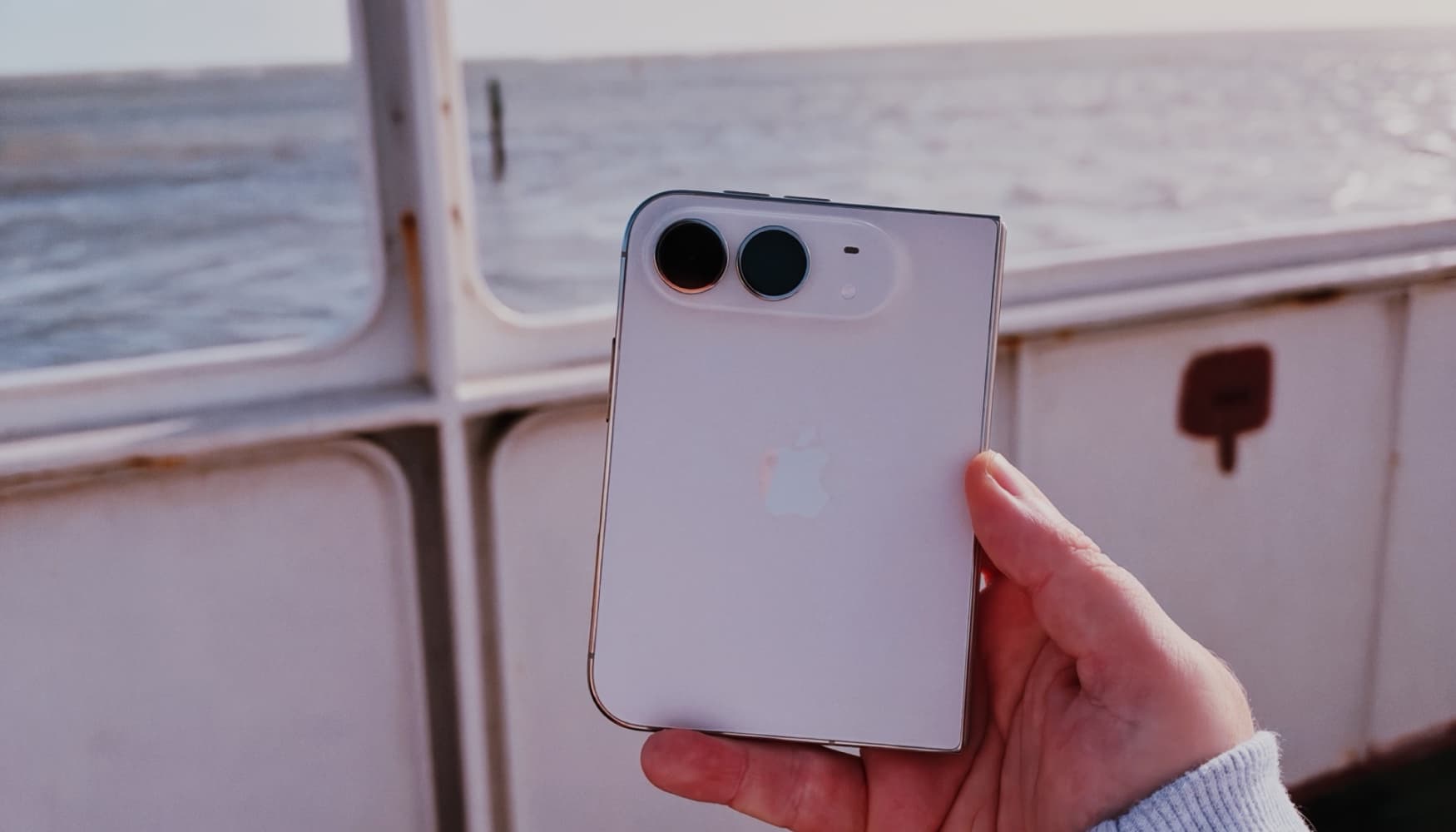
Image:
iHelp
Review. My own views after using the iPhone Duo every day since launch day.
I know it's a funny thing to say about a phone, but my relationship with the iPhone Duo has turned out to be a little bit toxic. I've had mine since launch day, a 256GB one in Star White. In that time I've gone from absolutely loving it one day to not quite believing how much it's frustrating me the next, and then straight back again. So rather than pretend I've made my mind up, I thought I'd share the good, the bad, and the bits that keep pulling me back in.
- Love it: the battery life, the hinge and its poses, multitasking, the screens and the speakers.
- Not so much: the cameras, the crease, the cases, the charging port and the cramped space above the keyboard.
Love at first fold
Let's start with the honeymoon period, because there's plenty to love, beginning with the battery life, which is really impressive. On a normal day I've got to bedtime without needing to charge it. A couple of times I've even left it off the charger overnight and still used it until about midday the next day. Apple quotes up to 24 hours of typical use, and from what I've seen, I believe it.
The hinge is phenomenal too. It holds whatever angle you leave it at so firmly that the different stands and poses become something you actually use rather than a gimmick, and I've used them so much. Stood up like a tent with YouTube on, it's been really handy in the kitchen while I'm cooking, and it's great for keeping an eye on timers too. When I'm working, I'll stand it up on the side just so I can see the time at a glance, and things like that. They're small quality-of-life improvements, but I find them really handy.
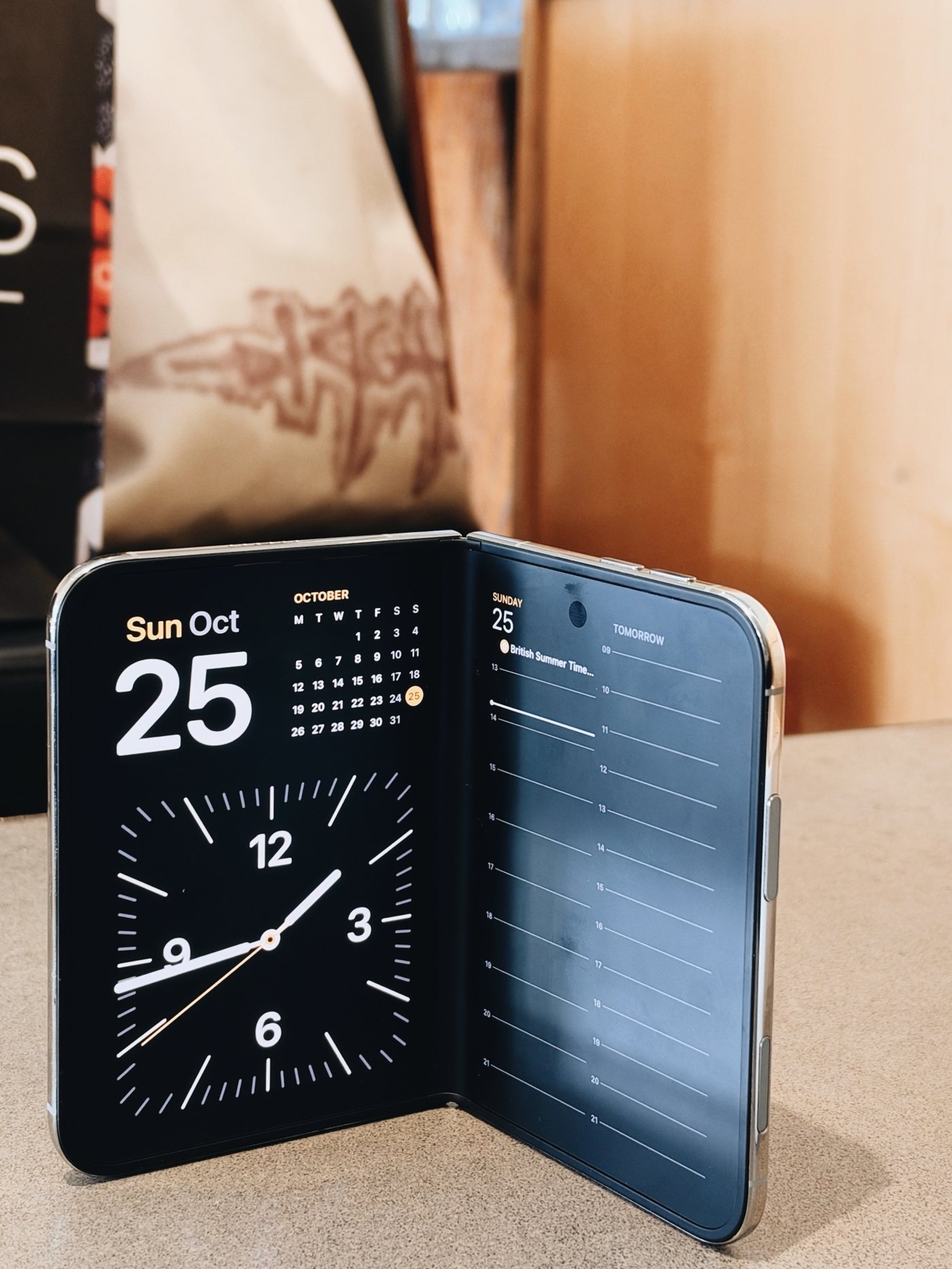
Typing on the inner screen in portrait is perfect, and a really, really nice experience. Multitasking and picture in picture are where the Duo feels like something new, and I think Apple has done a really good job with them. When you've got two apps side by side, you can save that split so it's ready for next time. Each side is also treated as its own space, so you can swipe up on one half and switch to a different app without touching the other. I've had Claude open on one side and the database behind the iHelp website on the other, checking and changing things as I went, which you'd never have been able to do so easily on an iPhone before. If you're on a phone call and need to look at an email, you can just pull it up, or even browse a website at the same time, without losing track of either. I'd love to see this come to the iPad, because I feel Apple has made iPad multitasking overly complicated over the last few years, and it's become harder to do the simple things as a result.
The screens look great, with lovely colours, and I've used it outside and thought it looked superb. The speakers really impressed me as well. And earlier this week, while I was travelling, I published blog posts from it, which felt like having a little computer in my pocket. When I'd finished, I simply folded it up, popped it away, and that was that.
Not quite right
Then there are the moments when I really dislike it, and the biggest one for me is the sidebar and navigation sitting on the right-hand side when it's open. I don't mind the idea of the sidebar itself, and there are times when I find it really handy, simply because it's on the right-hand side, where your hand naturally is. But I feel there are places where Apple hasn't fully thought it through, and Safari is definitely the biggest of those. It's caused plenty of conversation since launch, so I know I'm not alone. And of course, if you're left-handed, it's not very handy at all. In fact, it's probably the complete opposite. Apps are slowly being updated with designs made for the Duo, which is great to see, and we keep a list of the ones that have on our iPhone Duo apps page. But a lot of them feel as though they're bending to fit the Duo rather than making the most of it, and that isn't always to your advantage as the person actually using it.
It's all in the details
But then there are the little things that Apple does better than anyone else, and the Duo is full of them. The animation when you open it is so satisfying, and somehow it never gets tiring, however many times you see it. There's a new little indicator for your battery, Wi-Fi and mobile signal that looks beautiful, and it's so handy that you can just tap it instead of having to swipe down from the top of the screen. Even the feel of opening it is lovely, and once it's open it feels so light in your hands. It's only 5.2mm thin when it's open, and with the weight spread out like that, you hardly notice it.
Thumbs up, scrolling down
On the outside, when it's closed, the Duo is a short, wide phone with a 5.4-inch screen, and typing on it reminds me of using a BlackBerry. If you ever had one, you'll know that's a lovely thing to be able to say. It feels quick and comfortable and just right for your thumbs. Where it falls down is when the keyboard is open and you need to scroll back through what's above it. Say you're writing a message and want to look at something earlier in the conversation, or you're writing a tweet and want to refer back to the one you're replying to. The little window left above the keyboard is so small that it's quite difficult to do that easily. It's in moments like those that you notice how little vertical space there is, and it could definitely be better.
An accidental cure for doomscrolling
Here's something I didn't expect: the Duo has actually made me scroll less, and not because the front screen is hard to use. Anything like TikTok, Instagram or YouTube just makes you want to open it up and watch on the bigger screen. Once you do that, it feels much more purposeful, like you've properly sat down to watch something. We're all used to seeing people scrolling away on their phones, but when you take out something that looks like you're sitting there watching videos on an iPad, it feels a bit different, socially at least, and a little show-offy, I guess you could say, so I find I don't do it as much. What I've ended up doing on the front screen is the basic stuff, like replying to a message, checking my emails, making a note or ticking something off my to-do list. Then when I want to crack on with something more serious, or I fancy a bit of entertainment, I sit down, open it up and use the big screen properly.
The weight is over. Mostly.
At 254 grams it's a heavy phone (an iPhone 17 is 177 grams), but in the hand I've found the weight makes very little difference. That's mostly down to its height. Closed, it's 117.8mm tall, about 3cm shorter than an iPhone 17, so it isn't towering over the top of your hand with gravity pulling it down, and it doesn't feel that heavy one-handed at all. Where you do notice it is in your pocket, where it suddenly makes its presence felt, and I definitely can't imagine exercising with it in there.
Case closed
Accessories are pretty poor at the moment. Most of the cases I've seen add so much bulk that the Duo ends up feeling fat and chunky, and I think they look hideous. The only smart one is Apple's own folio case with the little kickstand, but as plenty of people have noticed, it comes with its own frustrations. The flap gets in the way if you want to use the front screen with the camera, and it doesn't fold all the way round flush, so it won't sit flat on a table. So I'm not using a case at all. Ironically, I think the best case for the Duo isn't a case, it's AppleCare+. It's already a heavy phone, so you don't really want to add even more bulk, and if you can get away without a case, I'd say that's the best way to have it.
The devil's in the details, too
Of course, this is the Toxic Duo, so for every lovely detail there's one that winds me up. The first is one you can feel. When I'm using the inner screen in portrait and scrolling, I can feel the crease quite clearly under my finger. It's a small thing, and I know some people won't mind it at all, but for me it makes the phone feel a little less premium than it should at this price. That's a shame, because the screen itself looks fantastic.
The oddest, though, is the charging port. It's on the left-hand side when the phone is open, which is the half that sits on top when it's closed, so if it's plugged in when you open it, the cable gets dragged over with it, which is really irritating. The buttons have taken some getting used to as well. The volume buttons are in a spot I'm still adjusting to, and because the buttons on the right-hand side are fairly close together, I often find myself pressing the side button or Camera Control by accident when I'm unfolding it. And a small one, but if I open it fully and lay it face down, it doesn't sit completely flat, because the hinge never quite opens out the whole way for me. I don't know whether that's just mine or whether everyone's is the same, so if you've got one, let me know in the comments.
Shot on iPhone? Not quite.
This is the big one for me. The Duo starts at £1,999 and has two cameras on the back, a 48MP main and a 48MP ultra wide. They're OK, but for a phone at that price in 2026, I think you should be asking for better. I had an iPhone 17 Pro before this, and I've bought an iPhone 18 Pro to compare them side by side, and there's a noticeable difference, especially on the main lens. The 18 Pro costs £800 less, at £1,199, and you get far better cameras, including a telephoto that goes up to 8x optical-quality zoom. Apple even lists the same "48MP Dual Fusion" camera system on the £899 iPhone 17. To be fair, it's nice that the Duo gets a few of the newer camera controls, like white balance.
The camera on the inside sits under the screen, and in my eyes it isn't even worth talking about, because it's pretty atrocious. Yes, it'll be fine for FaceTime calls, I suppose, but I think we're within our rights to expect better from the cameras across the whole device. The front camera on the outer screen is fine, and it's not bad at all. But if you use the outer screen to take photos, the camera controls take up so much space over the picture that it feels a bit cramped.
To be fair to it, here are a few photos I've taken on the Duo. None of them are straight out of the camera, because I've edited them all, but in good light it can still take a nice picture. These three I edited in VSCO.



And these two I edited in the Photos app, using Apple's new Photographic Styles, with Amber and Film on both.


Relationship status: it's complicated
This is where it gets really toxic, because I'm completely undecided, and the new iPad mini has made it even harder. On one hand, I could keep the iPhone 18 Pro for its much better cameras and get an iPad mini for all the things I'd use the Duo's inner screen for. On the other, I could keep just the Duo and have everything in one pocket, but then I lose out on those better cameras. What makes it trickier still is that, at their starting prices, an iPhone 18 Pro (£1,199) and the new iPad mini (£699) come to £1,898 together, which is about £100 less than the Duo on its own.
My verdict
For Apple's first attempt at a folding iPhone, I think it's a very solid one. The build quality is superb and the displays are superb, but the cameras are below par and the software, on the whole, needs refining. I'm sure Apple will get there, because it has a great history of refining things, and app developers have the same history of catching up. But as things stand, if you're unsure, I'd give it a bit of time out in the wild. See how things develop, both with Apple's software and with the apps, and then decide. That's why it's marked "Worth waiting" in our buying guide for now.
If you've got one, I'd love to know whether your relationship with it is as complicated as mine, so tell me in the comments below. And if you're weighing it up, or you've just got one and want a hand getting set up, you can ask iHelp AI anything at any time, or book a session with us, remotely anywhere in the UK or in person across Dorset.
Alex
Get posts like this by email
Apple news, buying advice and tips in plain English, from the iHelp team.
Now and then, never spam. Unsubscribe any time. Privacy
Comments